
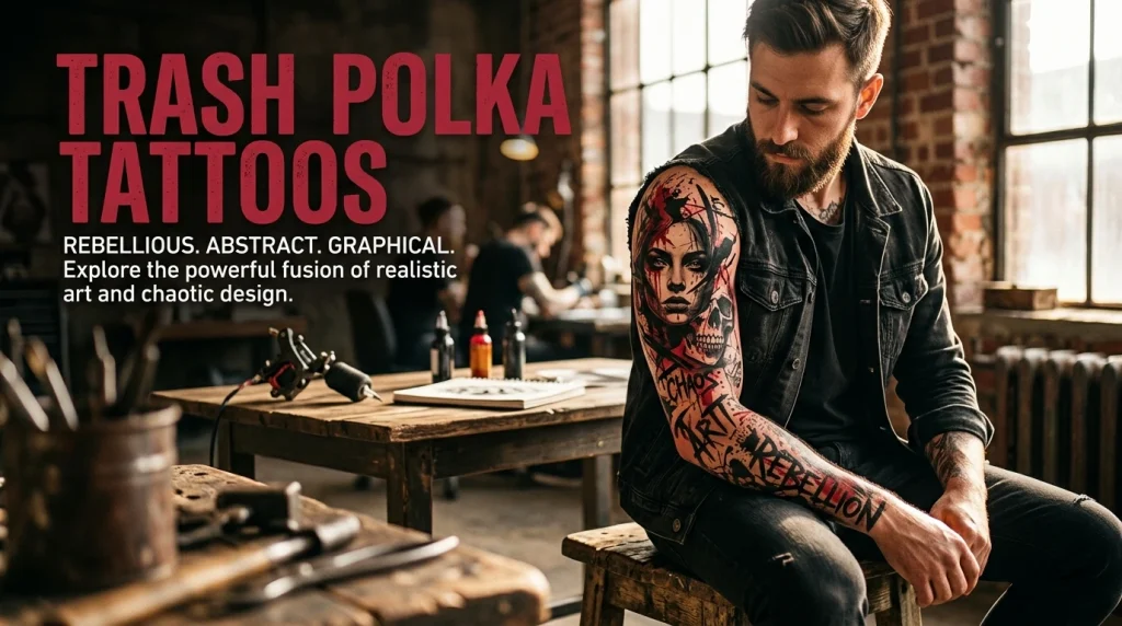
The Birth of a Radical Aesthetic
Trash Polka stands as one of the most disruptive innovations in modern tattooing, originating in Germany in the late 1990s by artists Simone Pfaff and Volko Merschky. Unlike traditional styles that rely on clean lines, smooth shading or cultural symbolism, Trash Polka is defined by controlled chaos. The signature palette dominant black and vivid red against natural skin tones creates a high-contrast, almost digital visual explosion. This is not merely a tattoo; it is a deliberate deconstruction of order, merging photographic realism with wild, abstract graphics. By rejecting the need for a unified background, Trash Polka treats the body as a canvas for collage, where layered images clash and cooperate simultaneously.
The Duality of Realism and Abstraction
What makes Trash Polka truly experimental is its jarring juxtaposition of two opposing visual languages. On one hand, it incorporates hyper-realistic portraits, anatomical studies or mechanical parts rendered with precise shading. On the other, it smothers these images with abstract elements: chaotic paint splatters, bold geometric blocks, jagged typography, film strips or static noise patterns. These abstract overlays often obscure portions of the realistic image, creating a sense of fragmented memory or digital glitch. The red ink does not serve as simple filler; it acts as a secondary protagonist, used for dramatic highlights, bloody accents or to symbolize raw emotion, passion or entropy. This clash forces the viewer’s eye to bounce between representation and abstraction, never allowing a single, comfortable reading of the design.
The “Anti Template” Approach to Body Art
In the realm of innovative ink, Trash Polka is celebrated for its rejection of repetition no two pieces should ever look identical. Because the abstract elements (splatters, stripes and noise) are often applied spontaneously or semi randomly, each tattoo becomes an unrepeatable artifact of its moment of creation. This style thrives on narrative complexity, often incorporating newspaper clippings, handwritten notes, or fragmented film frames to tell a non linear story about mortality, technology or identity. It demands a high level of trust in the artist, as the final composition relies on dynamic balance rather than symmetry. For the wearer, a Trash Polka tattoo is not a decoration but a statement of artistic rebellion a wearable experiment that celebrates imperfection, high contrast and the beauty of visual disorder.
01. “Digital Decay Tattoos” – Glitched Portrait of a Musician
The Concept – When Legends Fade Like Corrupted Files
Digital Decay reimagines the music icon not as a timeless idol, but as a signal breaking apart in transmission. In this Trash Polka design a hyper realistic portrait of a musician (think Bowie, Cobain or a custom face) is rendered in soft black-grey shading, capturing every pore, wrinkle and emotion. But instead of preserving the image, the artist deliberately corrupts it. Horizontal scan lines slice through the eyes, pixelated blocks erase the jawline, and static noise patterns creep in from the edges. The red ink applied as erratic bars, bleeding glitches or a single dramatic smear across the mouth suggests both digital error and raw, human blood. The message is clear: even legends are consumed by the very technology that amplifies them.
Technical Execution – Merging Portrait Art with Data Corruption
What makes Digital Decay experimentally bold is its technical contradiction. The realistic portion demands classical portrait skills: smooth gradients, anatomical accuracy, and soft transitions between light and shadow. Then, without warning, the artist switches to aggressive abstraction. Using stippling, dry brush techniques and negative space, they create the illusion of corrupted video footage. The red ink is not shaded but applied in flat, hard-edged blocks or chaotic splatters, mimicking a glitch overlay from a broken LED screen. Film grain textures, fragmented barcodes, or distorted equalizer waves can be added in black to reinforce the “digital” theme. The composition deliberately avoids symmetry one eye may be perfectly clear while the other dissolves into red and black noise, forcing the viewer’s gaze to flicker between reverence and discomfort.
Meaning & Placement – The Noise Between the Notes
This design speaks to the modern paradox of music consumption: we worship artists through digital screens, yet the medium reduces flesh and blood performance to cold data streams. Digital Decay captures that tension beauty breaking apart, emotion lost in transmission, the glitch as a metaphor for burnout, addiction or posthumous legacy. Ideal placement is the forearm (where the glitch can wrap naturally), the calf (allowing vertical scan lines to follow the muscle) or the ribcage (for a more intimate, fragmented composition). Because Trash Polka rejects perfect replication, no two Digital Decay tattoos will ever look identical each musician, each glitch pattern and each red accent becomes unique to the wearer’s interpretation of fame, memory and technological erosion.

02. “Mechanical Heart Tattoos” – Organic vs. Machine
The Concept – The Pulse of Flesh and Steel
Mechanical Heart confronts one of humanity’s oldest questions: are we biological organisms, or complex machines? In this Trash Polka design a hyper realistic human heart rendered in soft black grey with visible veins, arteries and wet, glistening tissue sits at the center of the composition. But this organic core is not pure. Bursting from within and around it are mechanical intrusions: brass gears, steel pistons, rusted rivets and tangled circuit board lines. The red ink does not simply color the blood; it becomes the chaotic energy animating both systems splattered like hydraulic fluid one moment, pooled like venous blood the next. The result is a visceral dialogue between tenderness and cold efficiency, between the heart as a symbol of emotion and the heart as a mere pump.
Technical Execution – Merging Anatomy with Industrial Abstraction
What makes Mechanical Heart experimentally innovative is its layered technical demands. The realistic heart requires precise anatomical knowledge: correct positioning of the aorta, ventricles and coronary arteries, with soft shading to suggest three dimensional wetness and light reflection. Then, the artist abruptly shifts into mechanical abstraction. Using sharp, straight lines and stippled black gradients, they insert gears that interlock with the heart’s own chambers. The red ink is applied in two distinct ways: as controlled highlights on specific rivets and gears and as wild, unpredictable splatters that seem to spray outward from the heart’s core. Abstract elements like fragmented blueprint lines, measurement arrows or torn schematic paper can be layered behind the heart in faint black, reinforcing the “machine” theme. The composition intentionally avoids symmetry one side of the heart may appear almost entirely organic, while the other dissolves into clockwork and static.
Meaning & Placement – The Beautiful Horror of Hybridity
This design speaks to the modern experience of living with technology inside our bodies pacemakers, prosthetics, insulin pumps, and even smartphones that have become extensions of our consciousness. Mechanical Heart captures both the horror and the hope of that fusion: the fear of becoming soulless machinery and the awe of human resilience engineering. It can also honor medical survivors, mechanics, engineers or anyone who feels split between raw emotion and logical control. Ideal placement is the left chest (directly over the anatomical heart), the inner forearm (where the heart can be smaller but highly detailed) or the ribcage (allowing gears to extend along the bones). Because Trash Polka celebrates controlled chaos, the balance between organic and mechanical can be adjusted more flesh for a romantic interpretation, more steel for a dystopian one. No two Mechanical Hearts will ever beat the same rhythm.

03. “Cinema of the Damned Tattoos” – Film Strip & Skull
The Concept – Reel of Mortality
Cinema of the Damned transforms the classic memento mori into a fragmented, cinematic nightmare. At its core sits a hyper realistic human skull rendered in soft black grey with deep, hollow eye sockets, visible cranial sutures and subtle cracks suggesting age or trauma. But this is no static symbol of death. Wrapping around, through and behind the skull is a perforated 35mm film strip, frozen mid project. One or two frames contain tiny, screaming faces or distorted eyes, barely visible yet deeply unsettling. Torn newspaper fragments with words like “END,” “LAST SHOW,” or “CUT” scatter across the composition in jagged typography. The red ink acts as both blood and horror film cliché splattered like arterial spray, striped like a censorship bar, or pooled in the eye sockets like dying light. The message is clear: every life is a film, and every film ends in darkness.
Technical Execution – Layering Celluloid and Bone
What makes Cinema of the Damned experimentally bold is its fusion of classical vanitas with modern media decay. The realistic skull demands mastery of bone anatomy: the zygomatic arch, nasal aperture, and dental ridge must feel solid and tangible, with soft shading creating depth without hard outlines. Then, the artist introduces the film strip not as a neat border, but as a chaotic, twisting element that overlaps the skull’s forehead, slices across a cheekbone and trails off into static noise. The perforations (sprocket holes) are rendered in sharp black with precise spacing, contrasting against the skull’s softness. The tiny screaming faces within the frames are mini portraits, requiring micro realism despite their small scale. Abstract elements include film grain textures, scratched emulsion lines, and countdown markers (3…2…1…) scattered in faded black. The red ink is applied in multiple ways: as bold, horizontal stripes mimicking a horror movie title card, as fine splatters across the teeth, and as a single dramatic drip from the nasal cavity. The composition deliberately avoids balance the skull may be tilted, the film strip off center, the text fragments angled chaotically.
Meaning & Placement – Your Final Screening
This design speaks to film lovers, horror enthusiasts, directors, critics or anyone fascinated by the intersection of art, memory and mortality. It captures the bittersweet truth that stories like lives have a final frame. The screaming faces in the film strip can represent lost loved ones, past versions of the self or simply the universal scream against oblivion. The torn newspaper text adds a documentary layer, as if the skull belongs to a forgotten headline. Ideal placement is the thigh (allowing the film strip to wrap horizontally across the muscle), the forearm (where the strip can spiral around the limb) or the shoulder blade (creating a wide, cinematic canvas). Because Trash Polka rejects perfect symmetry, the balance between skull, film strip and text can shift dramatically between tattoos more horror or more elegance, more chaos or more structure. Cinema of the Damned does not ask you to look away. It asks you to watch until the very last frame.

04. “Butterfly Effect Tattoos” – Beauty in Chaos
The Concept – A Single Wingbeat Changes Everything
Butterfly Effect takes one of nature’s most delicate symbols the monarch butterfly and throws it into a storm of human violence and entropy. At the center sits a hyper realistic butterfly, rendered in soft black grey with intricate wing veins, powdery scales and a fragile, weightless body. But this is no garden illustration. Surrounding and overlapping the butterfly are chaotic abstract elements: jagged, cracked glass lines spreading outward like a shattered windshield; wild, scribbled black circles and spray painted dots; and torn fragments of newspaper with words like “CHAOS,” “CAUSE,” and “EFFECT.” The red ink delivers the emotional gut punch a single, vivid red handprint smeared across one wing, fingers slightly blurred as if in motion. A second handprint, fainter and in black, grips the butterfly’s other wing. The message is haunting: the smallest, most beautiful action can trigger destruction, and human touch even gentle often leaves a permanent stain.
Technical Execution – Contrasting Delicacy with Violence
What makes Butterfly Effect experimentally innovative is its radical juxtaposition of two completely opposing technical approaches. The realistic butterfly demands surgical precision: each wing vein must be razor-sharp, the body subtly shaded to suggest softness, the antennae curved naturally. The artist may use fine-liner needles and stippling techniques to replicate the powdery texture of real butterfly wings. Then, without transition, the composition explodes into aggressive abstraction. The cracked glass lines are rendered in sharp, angular black strokes some thick, some hair thin radiating from the butterfly’s center as if an impact has just occurred. The spray painted dots and scribbles are deliberately messy, created with splatter techniques or dry brush strokes. The red handprint is the centerpiece of chaos: it must feel organic, with uneven finger pressure, visible palm lines, and slight smearing at the edges as if the hand was pulled away mid motion. A second, ghost like handprint in diluted black sits on the opposite wing, suggesting a recurring pattern of interference. Torn text fragments are placed at chaotic angles, their fonts alternating between typewriter and handwritten styles. The composition deliberately refuses balance one wing may remain almost pristine while the other is nearly obliterated by red.
Meaning & Placement – The Weight of Small Actions
This design draws its name from chaos theory, where a butterfly flapping its wings in Brazil can theoretically cause a tornado in Texas. But Butterfly Effect expands that metaphor into the human realm. The handprint represents any irreversible touch a parent’s discipline a lover’s betrayal, a stranger’s violence, or even your own self destructive habits. The butterfly, despite its damage, remains beautiful and intact enough to fly, symbolizing resilience after trauma. The cracked glass suggests that the world or the self cannot be unbroken once shattered. This tattoo speaks to survivors, philosophers, activists or anyone who has experienced a small moment that changed everything. Ideal placement is the back of the hand (where the handprint feels almost self inflicted), the sternum (a vulnerable, central canvas), the outer forearm (allowing the cracked glass lines to extend toward the elbow and wrist) or the shoulder blade (where the butterfly appears to land before being marked). Because Trash Polka celebrates narrative tension, the ratio of beauty to chaos can be adjusted more pristine wing for hope, more handprints for tragedy. Beauty in Chaos is not a contradiction. It is the only truth we know.

05. “Industrial Flora Tattoos” – Rose & Blueprint
The Concept – Nature Drawn by Machines
Industrial Flora takes the most romanticized symbol in tattooing the rose and reimagines it as a mechanical blueprint for organic beauty. At the center sits a hyper realistic, wilting rose, rendered in soft black grey with delicate petal folds, visible thorns, dewdrops clinging to the edges and a slightly drooping stem that suggests decay or exhaustion. But this rose does not grow from soil. Emerging from behind, cutting across and wrapping around the flower are architectural blueprint lines: geometric grids, ruler measurements, mechanical diagrams, and fragmented schematics drawn in crisp, cold black ink. The red ink delivers the emotional contrast splattered aggressively at the rose’s center, dripping from the petal tips like both blood and ink bleeding into the blueprint. A single red “X” mark, stamped like an engineer’s rejection notice, hovers near the stem. The message is provocative: nature is no longer wild. It has been measured, categorized, rejected and redesigned by industrial hands.
Technical Execution – Organic Softness vs. Drafting Precision
What makes Industrial Flora experimentally groundbreaking is its demand for two opposing technical languages executed on the same skin. The realistic rose requires classical botanical illustration skills: soft shading to create petal depth, smooth transitions between light and shadow, and microscopic details like dewdrops with highlights and thorn textures. The artist may use round shaders and magnum needles to achieve the velvety appearance of real petals. Then, without warning, the composition shifts into architectural drafting mode. The blueprint lines must be razor straight, rendered with single pass liner needles or even stenciled geometric shapes. Measurement arrows, dimension lines and fragmented circles (suggesting gears or gauges) are placed with mathematical precision. The torn schematic fragments resembling pages from an old engineering manual are layered behind the rose in faint black ink, with visible fold lines and paper tears. The red ink is applied in three distinct ways: as wild, unpredictable splatters across the flower’s center; as precise, dripping lines following the stem; and as a stark, stamped “X” or “REJECTED” mark. The composition deliberately avoids harmony the rose may be perfectly centered while the blueprint lines are off-angle, creating visual tension between organic and mechanical.
Meaning & Placement – The Cost of Control
This design speaks to a wide range of personal narratives. For some, Industrial Flora represents the tension between human creativity and corporate standardization the artist forced to work within rigid systems. For others, it symbolizes the medicalization of the body: the rose as natural health, the blueprint as diagnosis, scans and surgical plans. It can also honor architects, engineers, designers, or anyone who feels torn between intuition and logic, between wild growth and measured precision. The wilting rose adds a layer of melancholy beauty that fades despite (or because of) being analyzed. The red ink functions as the emotional bleeding edge: passion bleeding into procedure, pain bleeding into progress. Ideal placement is the ribcage (where the stem can follow the natural curve of the bones), the outer shin (allowing a tall, vertical composition), the forearm (where the blueprint lines can wrap partially around) or the hip (providing a wide, curved canvas for both organic and geometric elements). Because Trash Polka rejects tidy resolutions, the balance between rose and blueprint can shift dramatically more petals for romance, more schematics for cynicism, more red for grief or rebellion. Industrial Flora asks a question without an answer: can anything beautiful survive being fully understood?


